Almost Instantly 2x, 3x, or even 10x Your Conversions From Your Order Forms:
Years of data and split testing have revealed that there are 7 key things that predictably increase conversation rates.
When it comes to web marketing, the small things can make a HUGE difference. The fact that on the web everything is fairly trackable and measured, leads to being able to really dial in the effectiveness of your sales pipeline. So today, let’s focus in on one area that is often overlooked: Your order forms.
Many people don’t fully appreciate the impact that even a tiny improvement in conversions can have on your bottom line, let me explain.
First off, you spend all your time, money and effort working to get prospects to your order form or shopping cart, so losing them there is very costly. Let’s take a look at a typical sales funnel’s numbers.
Let’s assume that you’ve got about 1000 people a month hitting your order form. You’ve done the marketing to get them to the point of thinking about a purchase and they have clicked on your order now button, and have finally landed in the one place they can actually make a purchase. If your order form is currently converting at about 10% (which is pretty standard,) and your product costs $1000 bucks, then you’ve just made 100 sales or $100,000. Not too shabby. However, if you can improve the conversion rate of your order form by just a few percent, let’s say a paltry 5%, you’ve now made $150,000! That’s $50,000 more dollars or said another way, that’s 50% MORE MONEY, for the exact SAME cost it took to get them there! Meaning that all that extra money is pure profit, because you didn’t spend ONE dime to get more people to the order form; you just increased the number of buyers that were already hitting the form. Nice, huh? See why it’s critically important to focus on your order form conversion rate?
Now that you understand the importance of this, let me show you the 7 principals I use to optimize the conversions of my order forms.
1. Your order form must be fully mobile responsive
Depending on which studies you read, statistics show that up to 80% of all web traffic is now coming from mobile devices. So your order forms MUST look great on any/all devices. They should be designed so that they are easy for people to read and fill out on their phones, tablets, or whatever.
2. Your form should contain trust badges
What are trust badges? There are several key ones you’ll want to have on your forms.
First you’ll want to have some about privacy like this:

Then you’ll want to have something about their information being secure, like this:

Then you’ll want to let your visitors know that you’re using the latest SSL security technology with an icon like this one:

Next, you’ll want to have a clearly displayed guarantee badge, that states your simple promise of money back, something like this:

I’m sure you’ve seen these elements before, but many people forget to add them when designing their order forms, and they are one of the small things that collectively add up to a big difference.
3. Minimal fields to fill out (Less means more)
I have a client that’s spent more than $1,000,000 on paid traffic over the past few years, and has tested this theory six ways to Sunday. He says that by just eliminating unnecessary fields from his order form, (fields like company name, phone number, etc,) he’s increased conversions by 5% with this change alone. The lesson here is that unless you absolutely MUST collect an additional data point on the order form, eliminate all non-essential form fields.
4. Clear support information
When you’re selling on the web (and you’re not Amazon, yet) your customers want to know that if they have a problem, they can call or email and get a live human being to help them. Your order form should have this info clearly displayed for all to see. I recommend having your contact/support info at the top and the bottom of the form, so no matter where your prospect is, they can clearly see that info.
5. Your branding should be consistent
You know that small icon that is displayed here on the left of the browser tab?
It’s called a favicon and it looks like this: ![]()
This is part of your web branding and it’s important to your visitors to know that they haven’t accidentally left your website or been redirected somehow.
The other key element to your branding is your logo. Your company logo should be clearly visible on your order form, for the same reasons as your favicon, it increases trust and let’s your visitor know they are in the right place.
6. Large, clear product image
This is something that a LOT of people screw up. It doesn’t matter if you’re selling a physical product or 100% pure digital product (like a video course, or eBook) you’ve GOT to have a large, clear representation of what they are going to get – on your order form. Many cart systems out there severely limit this ability and it’s a BIG mistake. People want to SEE what they are paying for, so you’ve got to make sure they can do so. Take the time to hire a graphic designer, if necessary, and come up with a nice looking 3D product image like this one from my business growth course: 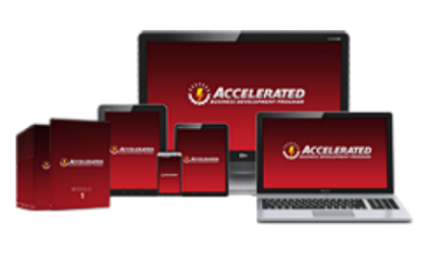
Having a nice product image like this, WILL make a huge difference in conversions.
7. Large, easy to fill out fields, and a clear order button
(web 3.0 style)
The web isn’t new anymore, and people expect things to be easy to read, and easy to fill out. When it comes to your order form, why would you do ANYTHING that didn’t accomplish that goal? You’ve simply got to have large form fields with an easy to read font in them. Make it easy for people to enter their information and complete their purchase with a nice BIG order now button.
When you look at the accumulative effect of adding all these elements together, I’m sure you can see that your order form conversions could easily increase by the 5% in our example above, but most likely will increase by a lot more.
Now if you’re using an online order form system like Infusionsoft, then you’re in luck because I’ve just released a brand new product that has EVERY single one of these conversion boosters built into it. Nothing to code, no API work, no need to hire a designer or programmer, just pick a template, add your info, and push publish. That’s it. It’s called FusedForms, and it’s simply the very best order form system for Infusionsoft anywhere.
In addition to all these conversion boosters, FusedForms, also has dozens of advanced features built for marketers that sell on the web. Things like a countdown timer (for limited time offers, expiring offers for things that go dark after a specific date), easily added custom fields, terms and conditions popup with the ability to require initials, ability to hide unneeded fields like phone number or company name, built in conversion tracking, and much, much more. Built by a marketer for anyone that processes orders using Infusionsoft, and backed by a full 30 day money back guarantee, FusedForms is the ultimate solution for easily creating order forms that convert at the highest rate possible.
Whether you use Infusionsoft or not, I hope you’ll take what I’ve shared with you today, and get your online order forms in shape.
Yours in profit,
- Bob Britton
